In a few words
Ecus can trace its origins back 30 years ago when it started as a department within The University of Sheffield. It has come a long way since then, and now, as an independent private sector environmental consultancy with offices across the UK, the business is undergoing a sustained period of growth and expansion.
The problem? A tired brand identity, brand assets and website. Having the credibility to sit at the top table and create strong first impressions among tier-1 consultants such as Aecom and the likes of Network Rail and High Speed 2 (HS2) is important for an independent consultancy. So Ecus looked to Fablr to help guide and develop the next chapter of their brand identity.

Key challenges
In a market dominated by the environmental divisions of large multinational engineering firms, Ecus is one of the few environmental consultancies large enough to operate at a national level, capable of working across the largest projects, yet small enough to maintain flexibility and responsiveness for their clients.
However, the Ecus brand and existing website had not kept pace with the commercial service offering Ecus offered and the stature of its commercial clients and partners. The business was struggling to clearly and confidently communicate its strengths as a project partner delivering highly valuable commercial solutions, insights and consultancy services.
During the opening discovery sessions we undertook with Ecus it was clear that they wanted an evolution of their brand rather than a revolution. There was equity in the brand and a valuable heritage in their specialist areas – such as Ecology and Habitats that stretched back over 30 years.
Like many SMEs embarking on a period of strong growth, Ecus needed an update to their brand which would positively influence both business development and their ability to attract the right industry talent to fuel that expansion.
"Fablr provided a collaborative and highly responsive service to us and ensured that our visions for the brand were turned into a reality."
Natalie Jane Eyre
- Marketing & Communications Specialist

Approach
We wanted to position Ecus as a mature, self-assured and commercially attuned professional partner for larger organisations with complex and technically demanding requirements.
Evolving the Ecus brand whilst retaining what makes it recognisable in its marketplace meant taking the basic colour palette and forging them into a stronger, more dynamic visual framework. The Ecus brand had to feel like an equal amidst the commercial backdrop of larger multidisciplinary competitors, but critically, one whose specialists and wider team are singularly focused and united around a single dedication – sustainability and the environment.
We saw in Ecus a balance between the environmental world – softer, flowing and organic in its nature – and the geometric structural forms found in the built environment and infrastructure projects that Ecus consults on around the country. Based on these observations we created a new visual framework and redeveloped combination mark logo that encompassed straight and curved forms, all set at 45 angles, giving a distinctive flowing structural quality to materials designed using the brand.
As part of the design process the logo was highly simplified to give it a modern corporate edge. The legacy logo’s three arrows (taken from the company’s historic link with The University of Sheffield) were re-imagined as more abstracted chevron forms – forms that respected this historical link but which had evolved so as to be interpretable as arrow flights, leaf forms, or river tributaries.
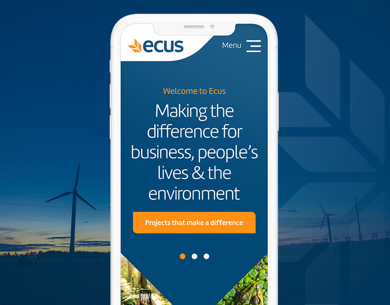
Our work on the redesign and redevelopment of the Ecus website was guided by the need to offer a highly flexible library of layout components for their marketing team to work with so that they could develop new pages on the site as their communication objectives evolved over time. Taking a component-led approach allowed us to evaluate how layouts, features and banners could be designed to meet the needs of multiple content areas like case studies, sector, and service listings.


Delivery
Ecus was delighted with the balance we had struck in our evolution of the brand. It provides the commercial edge and point-of-validation for new business and internal recruitment they had been missing, yet it also respects their origins and heritage.
With the new direction for the brand approved, we redesigned and supplied other key marketing collateral including brochures, social media assets and presentation deck templates.
The launch of the new website marks a new chapter for Ecus as they realise their ambitious growth plans over the next few years. To support this we were commissioned to develop an equally ambitious SEO strategy. We began with completing a round of technical optimisations and infrastructure enhancements on the new website before moving on to produce a holistic and locally-focused outreach strategy.
The focus of the strategy is engaging local charities, academic and education partners in meaningful collaborations across both public engagement and commercial partnerships. Supported with keyword research and content process guidance, we are now working with Ecus to help them deliver this strategy over the next six months.

