In a few words
Stroll commissioned Fablr to produce a proof of concept mobile application – a geo-location crowdsourcing application to help parents with young kids find child-friendly places where they can hang out, meet friends and take a moment to relax away from the hustle of day to day life.
Key challenges
It is a struggle for new parents to find places where they can take their children and expect the amenities and support that is all too important when out-and-about with a baby or toddler. New parents often feel constrained by the basic requirements such as group size, buggy space, nappy changing facilities, as well worrying whether or not they will be welcome with their newborn.
While there are existing apps for parents to use to find activities and fun days out for young kids, the Stroll mobile app aimed to provide a crowdsourcing alternative that would leverage the value parents attach to peer recommendations.
Following an initial validation exercise, the founders of Stroll approached Fablr to help them determine the best technical solution for their idea. Upon being handed the project, our role was far-reaching – developing the Stroll brand and designing the user experience, as well as developing the app, data structure and the supporting administration portals.

User experience
Although the concept had received some early validation by Stroll, we needed to understand more about the way parents felt about the pain points the app aimed to address.
We conducted phone interviews with parents to understand how they currently gathered information on what was available for them and their children in their local area – whether that be from online sources, local media, advertising or via their own social networks of parent friends. We asked them about their frustrations with these methods and tried to understand the challenges they faced. Using the information gathered we produced a positioning analysis for Stroll to define the key attributes they should promote as well as the functional and emotional benefits of the Stroll product.
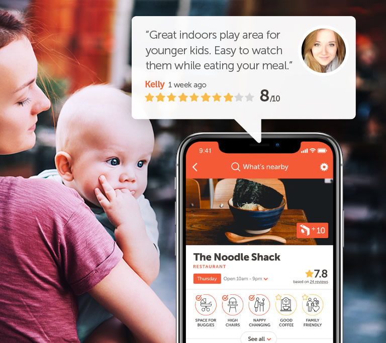
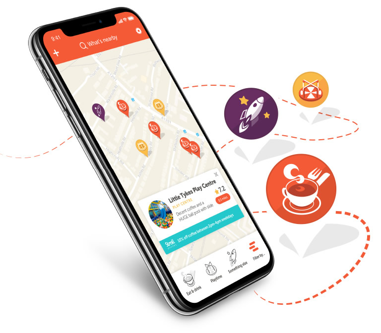
With our research and scoping phase complete, we created a number of interactive wireframe prototypes which we used to visualise the registration process, the map-based navigation and the UI for venue listing and detail pages. These were tested within a small user cohort to collect key user responses; not just to the signup process and user interface but also to specific messaging and language.
We incorporated learnings from these workshops into the design and development process, ensuring the final product addressed the difficulties new parents managed on a day-to-day basis.

Brand and design
We decided that we would develop a simple brand identity for the app despite it being scoped as a proof of concept. From experience we knew this could promote better emotional engagement and commercial appeal of the app with users and venue owners respectively.
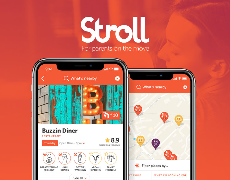
While the key component areas of API functionality and data manipulation were being developed, we undertook the creation of a more detailed second interactive prototype that would be used as part of a larger UAT exercise. This second iteration of prototypes featured the newly developed visual identity for Stroll across its user interfaces, imagery and iconography.
The feedback from these user workshops were then incorporated into the UI development phase and mobile app build.
"Fablr have played a key role in building Stroll. Their approach of immersing themselves in the project meant they felt like an embedded part of our team rather than an external agency. We'd have no hesitation in recommending them."
Paul Collins
- Director, Stroll Ltd
Development
We developed the mobile app using the Flutter framework – a Google-backed mobile development project which uses the Dart programming language. Flutter combines the flexibility of a hybrid application with the speed and power of a native built application. This reduced the cost of development considerably, whilst simultaneously allowing us to build a high quality product with a slick user interface.
For the mapping aspects of the app, we used the open source MapGL platform and pre-populated the locations in the app with suggestions from FourSquare API. These base locations could then be fleshed out by users of the app who would add photographs, confirm what amenities and facilities were available, and add their own review of the location.
To support Stroll in managing the app we also built a bespoke admin portal using the Symfony framework. This was a place where Stroll could review and moderate content added by users, as well as adding their own locations and tweaking the types of locations that would be imported from FourSquare API.
Results
The app was launched as a limited beta focussed on South London. Hundreds of locations were added by new parents and the feedback has been very positive with 5 star reviews on both the AppStore and Google Play.
The point of producing a proof of concept is to validate a business model, but also to assess the amount of work involved in promoting and monetizing an application. Since launching the application the team behind Stroll have decided to withdraw the Stroll mobile application from the AppStore and Google Play and to focus on developing the idea as a whitelabel crowdsourcing platform. They are currently in discussions with a range of tourism and creative organisations so watch this space for future iterations of the Stroll app.
