In a few words
So how do you stand out from the crowd in your sector and attract the best talent from across your industry? By raising the bar and resetting perceptions, that’s how.

Key challenges
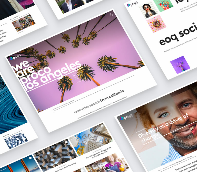
We developed the new Proco Group website for global supply chain executive recruitment firm Proco. Fresh from developing the Proco Commodities website in 2017, Fablr began working the Proco marketing team again to deliver their bold and ambitious group website.
Proco operates in thirteen countries around the globe. It’s a reflection of the multinational and interconnected industry they serve – supply chain, and its need for the best talent wherever it may be. Since it was founded in Brighton, Proco has grown not just in size but also in how it operates. Different recruitment brands and websites for different segments in the marketplace make good sense, but you also need a clear central voice and message for your business, particularly when it comes to internal recruitment and careers.
This group level website was the project that Proco asked us to offer our expertise on and to help them realise their vision. The functional value of the new website would be as a digital destination for all internal recruitment across the group offering a wider perspective on career routes that wouldn’t be possible on any of the individual websites. From a brand and marketing perspective the objective was to not only present the positive culture and potential rewards for working for Proco Group, but to also challenge some of the preconceptions about working as a supply chain recruitment. It needed to offer a bold and positive picture of the supply chain sector to attract talented consultants and researchers from other recruitment areas like IT and finance.
Proco’s own internal design team had produced a range of layout concepts and a proposed content structure at the point Fablr joined the project. As well as providing the technical capabilities to develop the site, our role would be to conduct a design review, further develop the visual concepts and create a rationale for the navigation and user experience.
"When your brief is all about visual impact and selling the brand, we felt strongly that the experience needed to be packaged in a more immersive way."
Geoff Bretherick
- Fablr Creative Director

Approach
When your brief is all about visual impact and selling the brand, we felt strongly that the experience needed to be packaged in a more immersive way. We proposed developing the website as an “hybrid (single page application” (or SPA).
SPAs are web apps that load once in the browser and then and dynamically update content as the user interacts with the app. It gives a much more fluid and responsive feel and allows the user to move from page to page within the app quickly without having to wait for the usual page load. However, SPAs are not traditionally used when it comes to marketing websites. The SPA structure necessitates certain limits on layout and content and the scope of content-heavy marketing sites like Proco Group could impact on the size and complexity of the app.
We opted for a middle-ground – delivering the top-level feature pages of the site in a bespoke SPA system in order to create that initial flow and engage with the user, then loading pages in a more traditional fashion once the user drilled down to more specialised content or blog articles.

Delivery
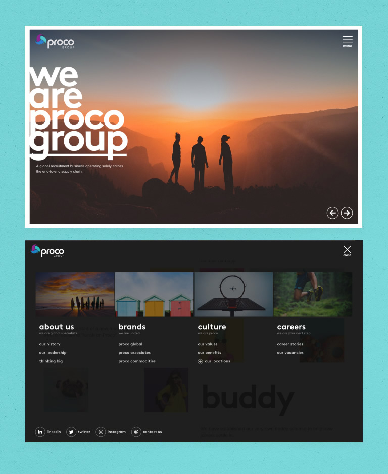
As part of our UX and design review we developed a navigation overlay that provides an immediate visual overview of all the content and categories on the site. Because of the SPA architecture, users also have the additional option of navigating between top level site sections using UI controls embedded the feature page banners.
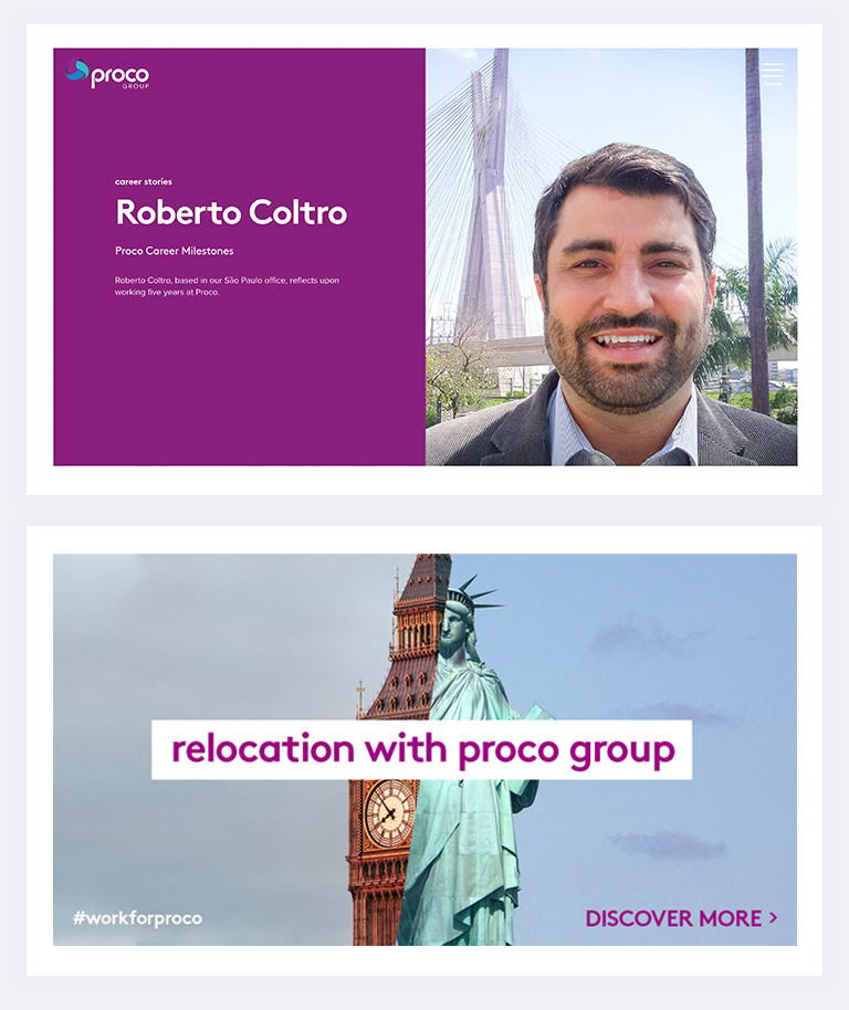
We designed page layouts that could act as key entry points on the site, offering aggregated content such as blogs and case studies from across the Proco brand sites. The site still needed a designated homepage that could offer visitors multiple entry points into the content. We created a visually bold UI based around the concept of tiles as expanding gateways to the various sections and subsections of the Proco group website such as culture, values, brands or careers.
The Proco Group website is a key differentiator for the company in the supply chain recruitment sector. It was key in communicating the benefits of working with Proco, of framing their customer stories, and of communicating their narrative effective.
Proco specifically asked for a customer WordPress theme as they had used WordPress previously and were comfortable with updating content through the platform.
With this in mind we leveraged the WordPress API and built a lightweight TypeScript framework to deliver content to the front of the site as part of the SPA – dynamically loading content in the background to ensure that users didn’t need to wait when they moved between top-level pages.
